Friday, August 28, 2009
Objective: Graphic Design 1 Reading 1
I thought the reading was organized in a well fashioned manner, in the fact that it made things easy to understand. I am a visual learner so i like to see examples. What was different about this article was the fact the the examples made you think before finding out the answer, and why the author of this article decided that, that certain example was appropriate for that certain part of the article. I also like how the article was broken up into categories, associated with the examples given. It was factual and interesting. I was dreading doing this reading because i am one that is not fond of reading, but this was not too bad.
Thursday, August 27, 2009
Objective: Definitions
Absolute Measurements: are easy to understand as they are measurements of fixed values.
Relative Measurement: many measurements such as a character spacing, are linked to type size, which means that their relationships are defined by a series of relative measurements.
Points: The point is the unit of measurement used to measure the type size of a font.
Pica: A pica is a unit of measurement equal to 12 points that is commonly used for measuring lines of type.
Em: The em is a relative unit of measurement used in typesetting to define basic spacing functions, and therefore it is linked to the size of the type.
En: An en is a unit of relative measurement equal to half of one em.
Legibility: The analysis of legibility involves a range of factors, perspectives, and methodologies.
Rag: Rags occur when highly noticeable shapes form by the line ends of text blocks that distract
Flush left text: type set to an even left margin, giving an uneven or ragged right margin.
Advantages:
Relative Measurement: many measurements such as a character spacing, are linked to type size, which means that their relationships are defined by a series of relative measurements.
Points: The point is the unit of measurement used to measure the type size of a font.
Pica: A pica is a unit of measurement equal to 12 points that is commonly used for measuring lines of type.
Em: The em is a relative unit of measurement used in typesetting to define basic spacing functions, and therefore it is linked to the size of the type.
En: An en is a unit of relative measurement equal to half of one em.
Legibility: The analysis of legibility involves a range of factors, perspectives, and methodologies.
Rag: Rags occur when highly noticeable shapes form by the line ends of text blocks that distract
Type Alignments:
Flush left text: type set to an even left margin, giving an uneven or ragged right margin.
Advantages:
- The space between words remains consistent. This is important to the readability of the text- the ease with which the readers eye traces the progression from one word to the next. It also ensures an even texture to a column of type, maintaining an even "gray value" from line to line.
- It is not necessary to hyphenate words. Strictly speaking. it need not to be necessary to hyphenate any word at all within flush text; in practice, it may be useful to specify hyphenation of extremely long words to avoid an excessively ragged right margin.
- It can be set across narrow columns.
Disadvantages:
- Asymmetry- the ragged right margins may disturb the balance of an otherwise symmetrical page layout. However, this might equally be listed as an advantage, since asymmetry can be the basis for dynamic typographic compositions.
Flush-right text: type set to an even right margin, giving an uneven or ragged left margin.
Advantages:
- Flush-right text is rarely used for text of any length. It can however, be extremely effective for setting small bodies of text, cations, and so on within asymmetrical layouts, where a ragged left column may create or resolve dynamic tension within the composition of the page.
Disadvantages:
- Reduced readability- the absence of an even left margin makes it more difficult for the readers eye to identify the beginning of the next line. This may be addressed by increasing the leading.
Centered test: type set on a central axis, with even word spacing and ragged left and right margins.
Advantages:
- Although seldom used for the setting of large quantities of continuous test, centered type can be extremely effective in the design of single pages in formal contexts (such as title pages).
Disadvantages:
- Reduced readability- the absence of an even left margin makes it more difficult for the readers eye to identify the beginning of the next line. This may be addressed by increasing the leading.
Justified text: The space between the words is adjusted in each line, giving even margins both left and right.
Advantages:
- Even margins left and right, giving a neat rectangular text area.
Disadvantages:
- The space between words will necessary vary from one line to the next, because each is adjusted to fill the same column width. This requires detailed adjustments to specification in order to avoid excessive spaces between words.
- Requires hyphenation
- Requires wide columns/larger number of characters per line.
Word spacing: The space between words has been traditionally been based upon a space equivalent to the body width of a lowercase i. This space can be adjusted manually for display and title setting.
Rivers: Rivers typically occur in justified text blocks when the separation of the words leave gap of white space in several lines.
Indent: Provides the reader with an easily accessible entry point to a paragraph.
Leading: is the measurement in points from one baseline to the next.
Kerning: The quality and extent of learning pairs within a font illustrate the attention to detail that characterizes high-quality typefaces that may, in many cases, include thousands of kerning pairs.
Tracking: Adjusting the overall space between letters, rather than the space between two characteristics.
Weight: Typefaces customarily include a choice of weights, from the single bold variant common to most text faces to intermediate weights such as book, medium, and demi or extremes, such as black or ultra bold. Among those typefaces that have only two weights, the interval between weights varies widely from one face to the next.
Scale: Content may be differentiated through the scale of type, by increases in point size.
Typographic Variation: Whether in the use if differing typefaces, weights, and sizes, the introduction of bold, italic, or small-cap fonts, should serve to clarify visually for the reader specific kinds of emphasis and prioritization, and to establish consistent distinctions between different kinds of content.
Orphan: is the final one of two lines or a paragraph separated from the main paragraph to form a new column, and should be avoided at all costs.
Widow: Is a lone word at the end of a paragraph.
Tuesday, August 25, 2009
Joseph Muller Borckmann


Josef Muller-Brockmann (1914–96) was a leader of the international typographic style, or Swiss design, the design movement characterized by the sans serif typeface and precisely aligned layout so commercially prominent in the 1960s and 1970s and still highly influential in design schools today
Joseph was a Swiss graphic designer, and teacher. He studies architecture, design, and history of art. In 1936 he opened his Zurich studio specialising in graphic design,, exhibitions design and photography. Then on he produced concert posters. From then on he became the editor of New Graphic Design.
He is noted for his simple designs and his clean use of typography.
The designer has been the main view of many articles and a few books, but design historian Purcell (Weegee) provides the most in-depth look yet at his work. He examines Muller-Brockmann's well-known work with grid systems, which forms much of his influence on the Swiss style.
JAN TSCHICHOLD


 Jan was born February 4Th 1902 in Germany. Jan was a man that was highly influenced by modern painters, and the Bauhaus. He was a man of many talents with an artisan background, and the skill of calligraphy. Being trained in this field set him aside from other typographers. Most typographers at this time would major in architecture or fine arts. This also explains why he never worked with home made papers and custom fonts; which was something that was very ordinary for typographers at this time.
There was an interesting story with Jan when he had to take up a teaching post. The Nazis had surged after ten days. Later on Jan and his wife got arrested. During the arrest soviet posters were found in their flat and they were kept under close watch. All the copies were seized by Gestapo.After six weeks a policeman somehow found him tickets for Switzerland.
Switzerland is a landlocked Swiss Alps country of roughly 7.7 million people in Western Europe with an area of 41,285 km?. Switzerland is a federal republic consisting of 26 states called Cantons of Switzerland...., and he and his family managed to escape Nazi Germany in August 1933.
Switzerland is a landlocked Swiss Alps country of roughly 7.7 million people in Western Europe with an area of 41,285 km?. Switzerland is a federal republic consisting of 26 states called Cantons of Switzerland...., and he and his family managed to escape Nazi Germany in August 1933.
In 1923 Tschichold was converted to the modernist design principles. He started off with a magazine supplement, then a personal exhibition, then wrote a book that was a manifesto of modern design called Die neue Typography. One of the things that Jan was was non centered designs. He advocated the use of standardized paper sizes for all printed matter. After the book came a series of manuals of the principles of modernist typography.
Between 1926-1929 he designed a universal alphabet. He created this to clean up the multi graphs and non-phonetic spellings in the German language.
He also designed a variety of typefaces which include:
Transit (1931)
Saskia (1931/1932)
Zeus (1931)
Sabon (1966/1967).
Main Objective: GRIDS
Def grid: A Grid is an organizational element that breaks space or time and helps one to navigate through a certain piece.
- Designers tend to use the grid because it it easily understood and can make productive design within a short period of space and time.
Def Hierarchy: A system of things that are ranked one in front of another
This can be achieved in multiple ways:
1. Placement of the page
2. Weight of the type style
3. Size
4. Graphic element
Def Type family: A typeface normally includes a number of separate fonts, including roman, italic, and at least one variant weight, normally described as bold. the typeface in turn may belong to a larger family called the type family. This consists of a condensed and extended versions and display faces. These tend to have related forms of differing widths.
Def Type Styles: This consists of a specific type such as Roman, Times, Aerial, etc.
Def Modular Grid: a modular grid has constant horizontal divisions from top to bottom, in addition to vertical divisions from left to right. These modules govern the placement and cropping of pictures as well as text.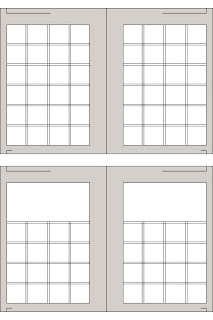

The diagram to the right is a example of a modular grid. Within a modular grid there are gutters, margins, columns, and grid modules. The Grid Modules are the white squares that you see to the right. The Gutters are the black like between each grid module. The Columns run up and down, and the Margins consist of the gray area around the grid modules or edges.
Subscribe to:
Comments (Atom)