For this project we had to pick an animal and represent it in 16 different ways. I chose a hippo because i thought that no one else would chose that animal in my class; and i was right. After designing the poster we had to pick 1 out of the 16 marks we designed, and advertise our imaginary company in a short commercial clip. Here is mine!
Saturday, August 7, 2010
Biodiesel Commercial, check it out!
This was a branding project. We had a Guy come in the worked with a corporation called biodiesel Initiative. This companies main goal was to use vegetable oil to fuel our machines that landscape/run our campus. This guy was looking for a new logo design, which would eventually re brand the entire look of his company. We had to make letterheads, envelopes, business cards, and any other collateral material we thought was needed. We also had to create a 10-15 second commercial clip that explained our logo, well here is mine.
Monday, May 3, 2010
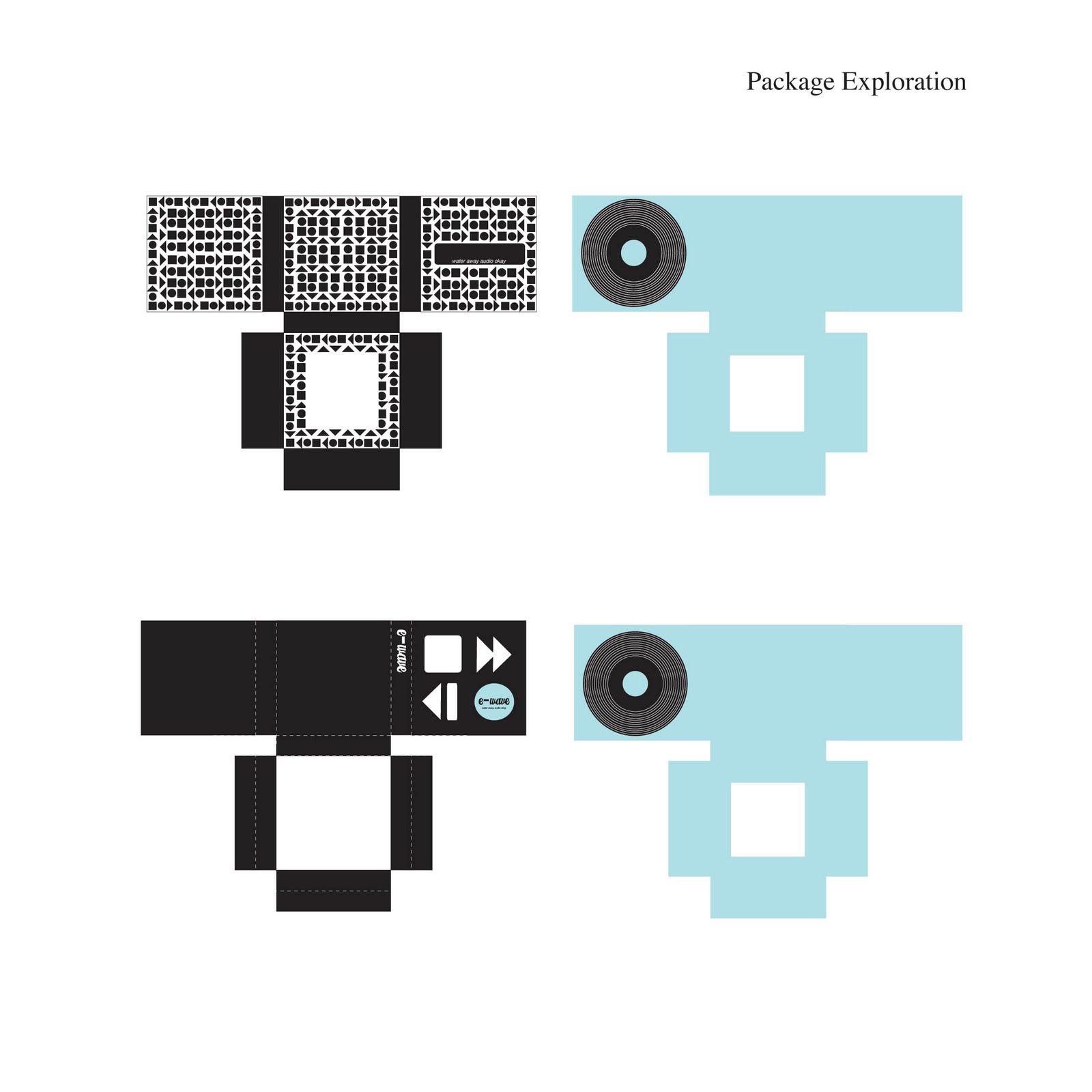
Final Package
Why i decided to make this product
Because Alyssa spends most of her time in the pool swimming, and studying, I decided to make a device that would combine both of these activites.
This Product is an audio player that lets you record your teachers lecture during class, and enables you to transfer the lectures to two small squishy ear devices.
This product is the new mutitasker. This product allows you to swim and listen at the same time.
With this product i will improve Alyssa’s lifestyle in the sense that she will have more time for herself and to engage in more conversations with her boo.
Where will this product be bought, sold, or marketed?
• Union stores on college campuses
• Magazines; speedo, and Nike
• Best Buy
• Dicks Sporting Goods
• Apple
What does it do?
• Records audio
• Plays music
Why is it useful?
• Serves purpose of an ipod or mp3 player.
• Records lectures from professors, or any audio
• Water proof
• Used as a multitasker; saves time so you have more time for oneself
What is it competing with?
• Ipod
• Mp3 player
• Ipod Video Goggle
What should my package communicate?
• easily accessible
• portable
• colorful
• fun
• new & exciting
• clean packaging
• medium sized
• sturdy
• stylish
outside

Inside

Round 2: Packaging Project
Now that we have done the research and picked a product; which was the audio ear plugs, that are going to call E-wave, it was time for some exploration.


Round One: Packaging Project
The first step of this process was to follow my roommate Alyssa Potter, and this was not out of the ordinary considering that she is my best friend. I documented her on a sunday afternoon, and the things i found out were quite interesting. The three examples below are my first interpretation of my findings. The three attempts consist information about Alyssa's life goals, who she spends most of her time time, and what she does on a day to day basis/ hourly basis.


Saturday, May 1, 2010
Overview of the semester
I think the project that had the most impact on me this semester was the workbook. At the beginning i thought this project was going to be a drag and impossible to finish; considering we got the assignment over spring break and i did not have a mac to work on the assignment. Thankfully we got some extra time and i really got a chance to get into the assignment after all the content was put into the book. This books is something that i will carry everywhere with me and i will always have this book to use as a resource. Sine next year i don't have Andrea as a teacher i am going to be living off this book. I'm really glad that i got a chance to do this assignment. Not only was this project the most inspirational, but it was my favorite project of the semester. I cant say enough how excited i was when it came home and found out that my book came in the mail!
How Creatity is Being Strangles by the Law
Notes
- anime music videos
- taking and recreating things digitally
- if you have $1500, you can have access to a computer
- copy right
- businesses need to embrace free content
- living against the law
- Younger generation is different than his generation. I liked when he said that his generation just watched TV and the younger generation is creating it.
Overall i thought this talk was pretty boring, but there were a few interesting parts; definitely the visuals help put things into perspective. I do enjoy listening to the ted talks, they are informative and usually pretty interesting.
Saturday, April 24, 2010
Journal 12
Paula Scher:
- Syncopate: meaning that everything is in order and there is one thing that is off set.
- Paula like to operate with her instincts; she is not much of a refiner, and usually her first idea is her best. People are amazed at the fact that she can come up with a logo within 5 min after meeting. People like to see the process but Paula believes that its not always necessary.
- She can work as fast as seconds when creating master pieces.
- I really loved her design maps; which was the way designers had to work before computers took over everything.
David Carson:
- Thinks that his success came because of his lack of training
- more computerized; more subjective
- putting your personality into your work is really important since everything we do now is don't on a computer. its very easy for all of your artwork to blend together.
I would like to ask David, what they next big thing that he thinks is going to happen?
Milten Glaser:
- Teaches because it makes him fell better
- teaching helps him understand understand his objective is designing
- Milten is astonished that things still amazes him
Thursday, April 22, 2010
Tuesday, April 20, 2010
Sunday, April 18, 2010
Journal 11
Who is debbie Millman?
the President of the design division at Sterling Brands, an international design consultancy. She has been there for fourteen years and in that time she has worked on the redesign of global brands for Pepsi, Procter & Gamble, Campbell’s, Colgate, Hershey and Hasbro. Debbie is President of the AIGA, the professional association for design. She is a contributing editor at Print Magazine and the chair of the new Masters in Branding program at the School of Visual Arts.
What is Design Matters?
In 2005, she began hosting “Design Matters with Debbie Millman,” the first weekly radio talk show about design on the Internet.
Interview?
i decided to watch the talk on William Drentell and Julie Lasky. My first thought was that i was just listening to an audio and this was going to be pretty boring, which it was. Something that i found interesting was when hey were talking about the recession and how thats going to affect graphic designers in the print world. The decline in print is going to lead to more media being displayed online and digitally, which i think is not a problem; considering the way our world is progressing with new technology.
Tuesday, April 13, 2010
Thursday Bloggage
How do i think that audience experience will change based on the media.
I think that the motion piece will have more of an impact due to the fact that there will be music to set the tone. Print is able to get tone through color and type size, but i feel that most people would be able to relate better to the motion if done right.
What can you do in motion that you cant do in print/print that you cant do in motion?
In motion you are able to break the text apart in a way that wouldnt be legiable if you transalted it to a printed version, but is legible in the motion piece. Meaning ; you can turn the type multiple ways, but if you saw the printed version it would not look legible or visually appealing, and vise versa. Print allows you to see the whole speach at one time.
Dont mind the content. Look at the way it flows and the way the pauses are worked in. Has nice pasing
Saturday, April 10, 2010
Journal 10
When looking at the good site, i watched the video about our planet and, i felt that there reallywasn't any pausing. What i think made it successful was the fact that there were simple graphics that went along to illustrate the type. There were a lot of illustrations that i didn't think needed to be there. I believe that anything can be achieved with just type. imagery is just something used to give it that extra something but it is def not needed.
Saturday, April 3, 2010
Journal 9 and some
Sequence Excercise:
I liked this excercise, it made me think about how to pace type and white space. In the past years i believe the students made a real one with pictures patterns and type, i think that it would have been nice to do the same. But the magazine book works just the same. This excercise can be applied to exhibition, book, and motion design in the way that when in the making we have to learn how to pace things. It has to flow nicely. Just like when people are talking, they takes breaks and pause with breaths. It is the same thing in designing books motion etc.
Motion Graphics: animating text
When watching the videos without the sound it is easy to get the message and the narration. When watching it with sound this help add the mood/tone. Sound also help you know when things should come on and off screen. I think that type in motion can work with it and without it
I really like the motion graphic with tally marks. They used the same thing just manipulated it in different ways. This reminds when when my peers and i got the same assignment (Jan Tschichold assignment) and i thought that there was no way we could all have something different but we did. It's nice to see something manipulated in so many ways. Everyone translates things differently.
I watched the example of kinetic typography and i noticed how they rotated, zoomed, spinned, typed backwords, made images such as steps, and patterns, and i also noticed how they used the pauses in the song. I remeber in after affects there is this camera icon that can make you change the perspective of the picture plane, and i think we will all be playing with that. This project is going to be interesting because the last time i worked in after affects i stuck to a flat video, this time i think i would like to change perspecitives, by turning things upside down, rotating them and doing all sorts of new things. I hope i find out how to do them!
With the 30 unforgettable movie title sequence, i enjoyed catch me if you can. There was a simple color palette, and i really like how the text blended into the characters. I also like the fact that it was a narration. I do think that this could be told without the music, but i think the music helps give it a ystery feel.
Another on that i liked was Thank you for Smoking. I enjoyed the beginning in the sense that they used the same picture, zoomed in on the object, and rotatoed it around and had multiple trasitions.
Lastly my favorite one was Kiss Kiss Bang Bag. I like this one becuase of the simple color palette, and most importantly i thought it had really nice pacing throughout. I loved the texture in the bullets and the guns shots. I think this one would not be as affective without the musice being that certain things were exphasized due to the music.
One thing that i noticed with all of these title sequece is that they all rely on some type of image. None of them soley use type. Are we getting dependant on image to bring out our messages?
Speach:
Who is speaking?
George W. Busch
Why is this speech important to society?
It was the start of the war on terroism
Why is it important and interesting to you?
I can remeber leaving school early and when i got home i saw that my mother was glued to the television wondering if our relatives were ok. I was scared for my safety and lcueless of what was to come next.
What is the emotion, mood, feel, and tone of the speech?
bereaved, bitter blue, cheerless, dejected, despairing, dismisal, distressed, down in dumps, down in mouth, downcast, gloomy, glum, grief-stricken, grieved, heartbroken, heartsick, heavyhearted, hurting, in doldrums, in grief, in the dumps, languishing, and low
How does it make you feel?
Scared and in shock that this had to happen to improve our security
How does the audience feel?
bereaved, bitter blue, cheerless, dejected, despairing, dismisal, distressed, down in dumps, down in mouth, downcast, gloomy, glum, grief-stricken, grieved, heartbroken, heartsick, heavyhearted, hurting, in doldrums, in grief, in the dumps, languishing, and low
Could there be another interpretation?
NO!
Bio about George W. Buch
born July 6, 1946, New Haven, Conn., U.S.) 43rd president of the United States (2001–09), who led his country's response to the terrorist September 11 attacks in 2001 and initiated the Iraq War in 2003. Narrowly winning the electoral college vote over Vice Pres. Al Gore in one of the closest and most controversial elections in American history, George W. Bush became the first person since Benjamin harrison in 1888 to be elected president despite having lost the nationwide popular vote. Before his election as president, Bush was a businessman and served as governor of Texas (1995–2000). (For a discussion of the history and nature of the presidency, presidency of the United States of America.)
Early life
Bush was the oldest of six children of George Busch, who served as the 41st president of the United States (1989–93), and Barbara Busch. His paternal grandfather, Prescott Bush, was a U.S. senator from Connecticut (1952–63). The younger Bush grew up largely in Midland and Houston, Texas. From 1961 to 1964 he attended Phillips Academy in Andover, Mass., the boarding school from which his father had graduated. He received a bachelor's degree in history from Yale University, his father's and grandfather's alma mater, in 1968. Bush was president of his fraternity and, like his father, a member of Yale's secretive Skull and Bones society; unlike his father, he was only an average student and did not excel in athletics.
In May 1968, two weeks before his graduation from Yale and the expiration of his student draft deferment, Bush applied as a pilot trainee in the Texas Air National Guard, whose members were less likely than regular soldiers to fight in the Vietnam War. Commissioned a second lieutenant in July 1968, he became a certified fighter pilot in June 1970. In the fall of 1970, he applied for admission to the University of Texas law school but was rejected. Although Bush apparently missed at least eight months of duty between May 1972 and May 1973, he was granted an early discharge so that he could start Harvard business school in the fall of 1973. His spotty military record resurfaced as a campaign issue in both the 2000 and 2004 presidential elections.
Here is the speech about September 11, 2001
Good evening,*today our fellow citizens,* our way of life,* our very freedom, came under attack* in a series of deliberate and deadly* terrorist attacks.* The victims were in airplanes*, were in there offices,* secretaries business men and woman* military and federal workers,* moms and dads,* friends and neighbors.* Thousands of lives were suddenly ended by evil* despicable acts of terror.* The pictures of airplanes flying into buildings,* fires burning*, huge structure collapsing* have filled us with disbelief,* terrible sadness* and a quiet* unyielding anger.* These acts of mass murder were intended to frighten our nation into chaos and retreat,* but they have failed.* Our country is strong*. A great people has been moved to defend a great nation,* Terrorist attacks can shake the foundations of our biggest buildings,* but they cannot touch the foundation of America.* These acts shatter steel* but they cannot dent the steel of American resolve.* America was target for attack because were the brightest beckon for freedom.* An opportunity in the world.* And no one* will keep that light from shining. Today our nation saw evil.* The very worst of human nature,* and we responded with the best of America.* With the daring of our rescue workers,* with the caring of for strangers who came to give blood* and help in any way they could.* Immediately following the first attack.* I implemented our governments emergency response plan.* Our military is powerful* and is prepared.* Our emergency teams are working in New York City and Washington DC.* To help with local rescue reference.* Our first priority is to get help to those who have been injured* and to take every precaution* to protect our citizens at home* and around the world from further attacks.* The functions of our government continue without interruption.* Federal agencies in Washington, which had to be evacuated today* are reopening for essential personnel tonight and will be open for business tomorrow.* Our financial institutions remain strong,* and the American economy will be open for business as well.* The search in underway for those who are behind these evil acts. Ive directed the full resources for intelligence and law enforcement communities,* to find those responsible,* and to bring them to justice.* We will make no distinction* between the terroist who commited these acts,* and those who harbor them.* I appreciate so very much the members of congress who have joined me in strongle condemning these attacks,* and on behalf of the American people,* I thank the many world leaders who have called to offer ther condolences and assistance.* America and our friends and allies* join with all those who want peace and security in the world.* And we stand together to win the war* against terroism.* Tonight I ask for your prayers for all those who grieve.* For the children whose worlds have been shattered.* For whose sense of safety and security has been threatened.* And I pray they will be conforted by a power greater than eny of us.* Spoken through the ages of psalm 23.* even though I walk through the valley of the shadow of death,* I fear no evil* for you are with me.* This is the day when all Americans from every walk of life unite in our resolve for justice and peace.* Amercian has stood down nany enemies before* and we will do so this time.* None of us will ever forget this day,* yet we go forward to defend freedom,* and all that is good* and just* in our world,*
Thanks you*
Goodnight*
And god bless America*
Key
* pauses
Large type: emphasizes thought
smaller type: quiet thought
In this speech George Busch does not raise his tone or lower his tone, so these were the places that i thought needed emphasis. Strong words about our nation should be in bold, and quiet thoughts such as prayers or thankyous were in smaller type.
Thursday, April 1, 2010


Monday, March 29, 2010
Journal 8
After reading the article about futura i began to think....i just used this font on a pamphlet for my personas project in Graphics 1, and maybe i shouldn't use it anymore....
When using any font you need to make sure that it makes sense and that you are using the specific typeface for a reason. So to back up why i used it was because in one of my posters i created a geometric typeface using only rectangles and i wanted my two posters to have some relation to each other.
This article was very interesting and i thought that it was clever the way it started out. It made me giggle because i just previously used it in a project.
A few other fonts that you can use besides Futura are Geometric, Interstate, and Franklin Gothic. All of these fonts get the same feel that you get from Futura; geometric and modern.
Thirteen ways of looking at a type face:
1. Because it works.
2. Because you like its history.
3. Because you like its name.
4. Because of who designed it.
5. Because it was there.
5. Because it was there.
7. Because it reminds you of something.
8. Because it's beautiful.
9. Because it's ugly.
10. Because it's boring.
11. Because it's special.
12. Because you believe in it.
13. Because you can't not.
oh the many reason why we chose what we chose.
Wednesday, March 24, 2010


Wednesday, March 10, 2010


Monday, March 8, 2010
Journal 6
Sean Adams:
he is inspired by the declaration of Independence. Something that can be translated by people all over and evolve over time is something that inspires him.
Chip Kidd:
we as designers develope identity's. Its important to take credit for what we do, and he says that as graphic designer we get upset at this fact because we are behind the scenes and he says this leads to out drinking.
Paul Sahre:
inspired by an object that his grandfather made who is not a graphic designer, which is a bottle of old spice and the head of a doll. He showed us front, side, and rear view. I thought this was interesting so the viewer could get the best understanding of the object that he was talking about.
The head of the doll was the same diameter of the old spice bottle, and he finds it intriguing because it recombines two other objects that are designed for their own purpose.Also says that we don't need to worry about design in the future, we need to focus on the problems we are facing right now.
This talk was my favorite because this is exactly how i feel about this topic. He hit it right on the nose.
I thought it was funny how he kept talking about his computer and how it will end up in a landfill someday.
Jennifer Moria:
Eames chair is the most inspiring design object to her, and her main talk was about how can we design smarter?
Design can affect change.
Linda Tischler:
She is inspired by Fredek's plan for central park and the fact that multiple people used this facility for all different reasons.
Timeline Progress

Project Two: Time Line
Establishing order: Graphic design often relies on typo
graphy to commuicate order, information, and sytems. The goal of this project is to make things easy to read, navigate and understand. As you learned in typography one, the foundation for creating an clear informational structure is a a strong typographic hiearchy. Type size, wieght, and color are the the first steps. Graphic elements (lines, arrows, grids) and page structure are often used to aid in establishing a clear hierarchy.
TIMELINE CHOICES:
_ History of the Bathing Suit
_ History of Earthquakes and Volcanic Eruptions
_ History of Photography
_ Prehistoric Timeline
_ 100 years of Flight
_ History of the Bathing Suit
_ History of Earthquakes and Volcanic Eruptions
_ History of Photography
_ Prehistoric Timeline
_ 100 years of Flight
CONTENT
_ timeline must have a range of dates
_ intro text
_ each point in time must have a date
_ and each point of time must have at least one sentance
_ images, icons, graphic elements are optional
Use the content from the website, you may use any additional resources for more information, images, etc. You may work in groups on collecting content.
CHALLENGE
How can you visualize the content? How can the audience get a quick understading about the topic? How are the pulled into the content to find out more?
TECHNICAL RESTRICTIONS
Format: poster or accordian folded book
Size: You determine the final size, poster min. size is 13 x 19 tall or wide
Color: Unlimited color palette
Typography: 2 typefaces, 3 type styles, and no more than 4 sizes of type.
Grid: proportional or ratio modular grid
Overview: Overall this project was a struggle for me to get a concept. I thought that i started off strong, but i was headed in the wrong direction. When i thought i had an idea i pulled a better one out of my butt. It was funny for me because i was trying to get my concept across through image, but im in typography class, and the best solution is TYPE. This project was very fast past, so that was also something that i had to adjust to
Sketches of bathing suits:


 Round 1:

 Round 2:


 Round 3:

 Round 4:
 Round 5:
Subscribe to:
Posts (Atom)