Don't just sit on your ass, because porkchops are not going to come falling out of the sky.
Monday, March 29, 2010
Journal 8
Wednesday, March 24, 2010
Wednesday, March 10, 2010
Monday, March 8, 2010
Journal 6
he is inspired by the declaration of Independence. Something that can be translated by people all over and evolve over time is something that inspires him.
Chip Kidd:
we as designers develope identity's. Its important to take credit for what we do, and he says that as graphic designer we get upset at this fact because we are behind the scenes and he says this leads to out drinking.
Paul Sahre:
inspired by an object that his grandfather made who is not a graphic designer, which is a bottle of old spice and the head of a doll. He showed us front, side, and rear view. I thought this was interesting so the viewer could get the best understanding of the object that he was talking about.
The head of the doll was the same diameter of the old spice bottle, and he finds it intriguing because it recombines two other objects that are designed for their own purpose.Also says that we don't need to worry about design in the future, we need to focus on the problems we are facing right now.
This talk was my favorite because this is exactly how i feel about this topic. He hit it right on the nose.
I thought it was funny how he kept talking about his computer and how it will end up in a landfill someday.
Jennifer Moria:
Eames chair is the most inspiring design object to her, and her main talk was about how can we design smarter?
Design can affect change.
Linda Tischler:
She is inspired by Fredek's plan for central park and the fact that multiple people used this facility for all different reasons.
Timeline Progress

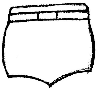
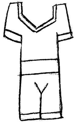
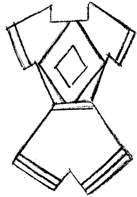
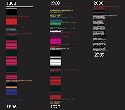
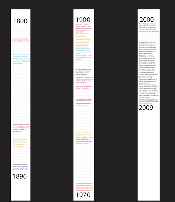
_ History of the Bathing Suit
_ History of Earthquakes and Volcanic Eruptions
_ History of Photography
_ Prehistoric Timeline
_ 100 years of Flight
_ timeline must have a range of dates
_ intro text
_ each point in time must have a date
_ and each point of time must have at least one sentance
_ images, icons, graphic elements are optional
Use the content from the website, you may use any additional resources for more information, images, etc. You may work in groups on collecting content.
CHALLENGE
How can you visualize the content? How can the audience get a quick understading about the topic? How are the pulled into the content to find out more?
TECHNICAL RESTRICTIONS
Format: poster or accordian folded book
Size: You determine the final size, poster min. size is 13 x 19 tall or wide
Color: Unlimited color palette
Typography: 2 typefaces, 3 type styles, and no more than 4 sizes of type.
Grid: proportional or ratio modular grid


 Round 1:
 Round 2:


 Round 3:
 Round 4:
 Round 5:


