Name Andy Rutledge
Location Plano, Texas
Web http://andyrutled...
Bio Designer, cyclist, composer, curmudgeon. Owner of Unit Interactive.
My early experience in the design profession was unlike that of most of my peers and colleagues. I did not attend design school and did not enter the profession with the academic design training most receive. Instead of starting a design career in my early to mid twenties, I started when I was almost forty years old, after more than two decades in retail and corporate management while at the same time being an intermittent artist and craftsman. As a result, I was never offered design advice from mentors or professors. My training as a designer has been mostly derived from 30 years as a musician-composer and bonsai artist. Additionally, my design understanding has been greatly augmented by an ongoing study of human behavior, psychology, and sociology.
I did, however, receive lots of formal training in music and artistry. Much of that training was and is as a private student of highly skilled professional artists and I continue that training to this day, for I believe that someone with no teacher is lost. As a result, I am a student and I will always be a student. I expect I’ll be a student when I’m 90.
sIFR_callback_4_DoFSCommand(info, args);
Love the Business as much as the Practice
So while I have certainly received instruction, have pondered lessons offered in books and in articles, and have learned lessons through practice, I have not really ever received advice the way that Tony had in mind when he wrote to commission articles for this series in his weblog. Even so, he asked that I contribute to describe my story and offer something that I’ve learned through experience.
Perhaps the most profound and impactful lesson I’ve learned was not something that came only through my own experience. It is something that was informed by my experience, but made clear to me again and again by observing other designers over time. Loving design and being an excellent designer is not enough to succeed as an independent; nowhere near enough. If a great affinity for business is not part of what motivates you, go to work for an agency or in-house for a company, but don’t go the freelance route or you will fail (and be very unhappy until that time). I have never seen an exception to this fact. The lesson is that if you want to be a successful independent design professional you have to love the business of design.
sIFR_callback_5_DoFSCommand(info, args);
Guest Author Bio
Andy Rutledge is Principal and chief design strategist at Unit Interactive. When not designing or hanging with the family, he is usually found banging on the piano or putting in a few miles on his bike.
Monday, November 30, 2009
Project 4 article
March 4th 2008, By Andy Rutledge: If you’re a web designer, do you consider yourself to be “a creative”? When you describe your profession to others, or when you promote yourself or your agency, are references to creativity prominent in your words? If so, how do you characterize creativity’s role or significance in your work? How closely do your references to creativity conform to the popular understanding of creativity…and how much to its actual nature?
This last distinction is important because the popular conception of creativity and its relationship to design is often distorted. As designers, we are, rightly or not, widely perceived as custodians and professional exponents of creativity. Therefore, the ways in which we define, employ, and represent creativity matter.
In light of this professional responsibility, it’s best that designers recognize the difference between idealistic definitions of creativity and the practical, effective nature of the applied creativity professionals must exercise—and then behave accordingly. Individual designers may have differing ideas about these issues. I believe that our ideas about creativity and how we employ it factor significantly in the quality of our design efforts and in our professional prospects, so I want to challenge your concept of creativity’s place in our work and professional communication.
So what is creativity?
Creativity is…
…never having to say you’re sorry. Yes, just like love. In fact, like love, we must never judge or ridicule creativity. Creativity is precious; it is our birthright and a glowing light that resides within each one of us, making us special and unique…
Well, not really. These sorts of sentiments are fine for young children needing reassurance and encouragement, but as designers, our creative efforts are judged—and rightly so. While many commonly popular definitions of creativity amount to little more than references to self-expression or flamboyancy, we designers should not be so lax or obtuse in our concept of it. Much hinges on our use of creativity, including our clients’ fortunes.
Creativity has nothing at all to do with self-expression or flamboyancy. Aside from the simple ability to create things, the most important feature of creativity is a highly developed perception filter that is somewhat less common than we’re led to believe. Despite what we were taught in school, we don’t all possess significant creativity, and fewer of us still have any skill at employing it. True, anyone can make something, and anyone can make something up. In this mundane sense, everyone is creative. But this basic truth belies the design-relevant definition of creativity, and ignores the fact that each one of us has different creative abilities.
Creativity is technical and analytical, not expressive (as in self-expression). It is a filter through which perception and output pass, not a receptor or an infusion (as in the case of inspiration). Creativity may require or be enhanced by inspiration, but the two are distinct forces. (These facts are vital in discriminating between appropriate and inappropriate descriptions and applications of creativity.)
Creativity is an inborn capacity for thinking differently than most, seeing differently, and making connections and perceiving relationships others miss. But most importantly, it is the ability to then extrapolate contextually useful ways of employing that data: to create something that meets a specific challenge. By this definition, creativity is merely a tool; it does not convey skill. For a dedicated few, though, this inborn capacity is then further augmented by certain disciplines, including:
ongoing curiosity,
the desire and habit of looking more deeply into things than others care to,
the habit of comparing stimulus with result, and
a habit for qualitative discrimination.
It is primarily these disciplines that set top creative professionals apart from those who are merely gifted. It is also these disciplines that help shape a designer’s intuitive senses, which are vital to design craft, processes, and overall success. Being merely creatively gifted is no qualification for design expertise, and the idea that creativity is a magic bullet that anyone or any designer may employ to positive effect is a vacuous notion.
There is another factor that’s vital to the effective use of creativity in the design process: timing, or when in the design process creativity should be employed. The most effective use of creativity begins with a litany of very un-creative things called “facts”—the facts we get to know during the discovery process.
Careful where you point that thing
The siren song of creativity is likely responsible for more bad design than any other factor. Some might think this overly dramatic, but I believe we should regard creativity as a rather dangerous tool. Like a firearm, it should be treated with caution and respect, and used professionally only by trained individuals.
If you are a designer worth your salt, you know that no design project begins with creativity. Instead, it begins with client- and/or context-specific discovery, and lots of research to help you understand the fundamental nature of the challenges at hand. All designers must guard against the urge to invest in specific creative ideas before becoming intimately familiar with the contextual landscape of a design project.
Sadly, creativity is often used as a crutch, or as a surrogate for design competence. Some individuals reveal themselves as clinging to this practice when they complain that some client work prevents them from “being creative.” What they mean here is that they dislike not being allowed to express themselves. But design competence has little to do with self-expression, and creativity is no substitute for knowledge or comprehensive understanding. Instead, design is most significantly founded on the comprehensive understanding and greatly developed empathetic/sympathetic sense that highly skilled and disciplined individuals bring to bear.
Design creativity often involves coming at a communication or interaction challenge sideways, or from another uncommon angle. In this way, you may find clever or otherwise compelling concepts upon which to base your solution. The thing is, you can never know what constitutes a sideways approach until you have fully explored and are intimately familiar with the entire landscape.
For instance, if your client is NASA and you’re asked to design a spacesuit that allows for a greater degree of physical movement and manual dexterity, you can’t leap straight into creative brainstorming and suggest a form-fitting spandex suit. That would be a creative response to the issue presented to you, but it would also reveal your ignorance of the overall context, e.g. the fact that space is a vacuum.
Creative mythconception
Before we continue, I want to touch on a common misrepresentation of creativity. In discussions with other designers, occasionally one might hear arguments for how web design creativity is or can be stifled by various external forces, like web standards or client-mandated constraints. But these sentiments indicate a flawed concept of creativity, its place in design, and its purpose in our process.
Any reference to constraints that limit creativity is just another way of equating creativity with self-expression, an erroneous and irresponsible idea. Except for personal projects, self-expression has no place in design, but constraint is vital to design. No component fuels creativity more than constraint. Indeed, without constraint, creativity (and design) is irrelevant. The discovery process is mostly about finding constraints, which is why we must do such a thorough job of it.
Constraints are a designer’s best friend. They’re signposts, not shackles. In a sense, constraints amount to the solution half-built. It is merely up to us to then realize the other half according to what these signposts indicate is appropriate. Nowhere in this concept does self-expression find any valid foothold.
Our intuitive, subjective design senses are relevant to our work. Part of a designer’s job is to show people what they want before they know they want it, and our success in doing so is based largely on our intuitive abilities. But there is a difference between what we prefer and what we know will work best. Competence demands that we understand this difference and filter purely subjective data from sympathetic, fundamentals-based creative work.
Steering the conversation
While my goal here has been to offer designers something to consider about their work and perhaps some challenging ideas to chew on, I have another purpose in all of this. At the start of this article, I asked how you conceive of and associate yourself with ideas of creativity, from a professional perspective. I noted that designers are generally considered to be the custodians of creativity in the professional world, but this distinction may soon come with a cost. So I want to describe a scenario I deem important to our profession, and perhaps to present you with another challenging idea.
If you read any of the prominent business magazines, like Forbes, Fast Company, Business Week, or Inc., you can find in every issue references to how creativity is vital to success. With the tangible benefits of great design being touted and trumpeted from every corner of the business world, companies aim to seize on what they believe to be the key factor in great design and innovation: creativity. What’s so appealing and what is apparently widely believed is that creativity is absolutely free and available to, and from, everyone on staff. Score!
Businesses are also beginning to look beyond their own sandboxes for the benefits of creativity. Many businesses are looking to customers to craft their marketing, believing that the vast pool of ordinary citizens is a valuable untapped creative resource. But when you recognize, as we do, that creativity is not a magic bullet, and that few individuals understand how to employ it effectively, you can sense trouble looming on the horizon.
The ideas circulating in business communities are misguided; the results of this sort of activity are usually wholly unproductive and inevitably lead to disillusionment. But that’s not all they’ll lead to. Another result of this failed effort is likely to be a vengeful backlash against “creativity.” This all-too-predictable pendulum swing will reflect poorly on design professions, which will be both unfortunate and unfair, given that creativity has so little to do with effective design.
Because of this impending trend in much of the business world’s perceptions and opinions of creativity, the design profession will increasingly be judged by how it represents creativity. Web design is one of the so-called creative professions, but that classification has potential to be an albatross around our collective neck, and I think it is a good idea for all of us to soberly consider how we represent value to our clients.
Think about it:
Are you most comfortable asking your clients to invest in your creativity or in your design competence? Or do you believe these two things to be synonymous?
If you are the client and you’re spending $450,000 or $45,000 or even $4,500 on design/marketing services, do you trust to design skill or creativity first?
When a client admonishes you with, “…now I don’t want you to get too creative on this one…” does it indicate that they’ve got a clear grasp of creativity’s place in design work?
Which quality is easiest to demonstrate to clients and potential clients: your creativity or your skill-based design competence?
Which quality do you think your clients can more easily grasp and perceive benefit from: your foundational design skills or your creativity?
All of these questions relate strongly to perception rather than substance, but we are in the business of crafting perception, and our substance depends on our clients’ and potential clients’ perceptions. It is our business to craft those perceptions about how creativity fits into our work—if we don’t, others will do it for us, and the result may not be to our liking. Key Points: never having to say you’re sorry, we don’t all possess significant creativity,Creativity is technical and analytical, not expressive (as in self-expression),thinking differently than most,By this definition, creativity is merely a tool; it does not convey skill. For a dedicated few,creativity is often used as a crutch,
First Blog for Project 4
Multiple column grids: divide the page and are distributed evenly across the page. The more columns give additional flexibility for the arrangement of visual elements. Creates an organized structure, asymmetry, line things up, also have opportunities to use different column widths.
Line length: type size, leading, and column width all contribute to how many characters are optimal for a line length but as a general standard for continuous text, forty-five to seventy-five characters per line is the ideal length.letter, space , and numbers are all characters. This is all done by hand because there is no computer program that does this for you.
Baseline grid: is an imaginary grid upon which type sits. The baseline of a piece of type can be forced to 'snap' to this grid to maintain continuity across the pages of a design.
Typographic river :is a river is a series of inconsistent word spaces that creates distracting open lines running vertically through the justified paragraph.
flow line: a flow line is a horizontal measure that divides the page into spatial divisions and creates additional alignment points for the placement of the visual elements.
White space: into your designs is important because space provides visual contrast and contributes to an effective ordering system. The empty compositional space brings the visual elements alive. This can be done by using less text, grouping things,leaving more space on the edges.
Type color/Texture: the choice of typeface, type size, leading, word spacing, and line measure affects the texture and color (tonal value) of text setting. (ex. Clarendon has strong horizontal emphasis while Helvetica has a monotone texture) the density of typographic elements and their perceived gray value - the overall feeling of lightness and darkness on the page. the density of text, being that things are leaded out and not bold.
X-Height & how it effects type color the x-height is the height of the lowercase letters without ascenders or descenders. Different typefaces have different x-heights which give them different textures, depending on the x height, the typeface can look darker or lighter
Justification: uses three values for type setting; minimum, optimum, and maximum. justification settings allow the designer to specify the minimum, optimum and maximum spaces between words. Justification settings also allow for additional spacing to be introduced between letters where necessary.
Ways to indicate a new paragraph: indent, ex dent, make the first letter larger, tracking, leading, extra spacing. etc
hyphenating text: make sure there are not more than two hyphenations in a row, too many hyphenations in any paragraph, and never hyphenate a heading.
Hanging punctuation: must be adjusted so the text will appear aligned and not distract the eye. This applies to asterisks, apostrophes, commas, en dashes, hyphens, periods, and quotation marks.
Hyphen: is strictly for hyphenating words or breaking words in paragraph settings
En dash: is a punctuation mark used in compound words and to separate items such as dates , locations, times, and phone numbers. (can also be used to separate thoughts within a text) when an en dash is used like this, spaces are added before and after the dash.
Em dash: is a punctuation mark used to separate thoughts within a text. There are no spaces needed before and after, but kerning may be required.
Ligature: is a specially designed character produced by combining tow or three letters into one unified form. It is one form used when two or more letters would normally touch or overlap. Common ligatures are fi or fl. Sometimes ligatures are not required because the typeface letter forms have be designed to minimize the problems that make ligatures necessary.
CMYK: cyan magenta yellow key
RGB: red, green blue
Saturday, November 28, 2009
Monday, November 9, 2009
FLASH
Flash is a program that designers use to give their website a bit of personality. Designers use them to help the user have a better experience/ a more personal experience with their page, rather than something that they just get board with.
http://www.typorganism.com/ was the first site that i went to that used flash. This site had some pretty awesome features. The main page was a series of buttons that led you to another page. There was one page that was all text, but when you first went to it there was nothing there and i was like uh hellooooooo, then i moved the mouse and the text came on the page and every time you moved it there was a ripple like water. another aspect of this site that was cool was a page that used all type to create an image of a mans face, or a pic of a cat, or Barack Obama's face. There was a lot more but your going to have to check out the site for yourself!http://www.reformschoolrules.com/ This site was pretty cool as well. They added a little bit of doodles to give the page a more personal feel. Some things were continuously going on the page and then there were things that you ran your mouse over and little icons would pop up.
http://www.theadventureschool.com/ The last site i went to had a little animation for each different thing you could check out about the page. and something that was interesting was that you could have all the little animations playing at one time.
Sunday, November 1, 2009
Data Flow

This example of showing the different colors of the flags in pie charts is by far one of the most interesting layouts that i have seen in all the examples. It jumped out at me when we were in class and again when taking a closer look. I love how the design is so simple but very exciting. Your eyes moves all over the picture plane. For me i always try to make things simple and easy and i think this idea demonstrates that concept very well.
Thursday, October 29, 2009


Wednesday, October 21, 2009


Sunday, October 18, 2009

Tuesday, October 13, 2009

Wednesday, October 7, 2009


Friday, October 2, 2009
Objective: Parts of Serifa
Serifa
Hmmmmmm well lets start with the letter "A." This letter has a flat apex, and has medium weight in the cross bar. The lower case "a" is two stories.There is nothing too special about the "d" except the ears are in even weight with the rest of the letters.
Now the "G" is something to talk about considering that it has a unique spur, and barb. Also the "G" has vertical spur.The lower case "g" is also something special because if you look carefully the bottom portion of the "g" does not go all the way to the base line. Also this "g" is considered to be a one story "g" with an ear.
There is really nothing too interesting about the "'M" except that the apex touches the base line.
The "Q" has a diagonal stress and a short tail. Another letter with a short tail is the "R".
The "x" is unique because within "x" there are arrows on the top and the bottom, and i must say after some one showed this AMAZING aspect of the letter to me it opened my eyes. I haven't looked at the letter the same ever since.
The leg of the "t" curves upward, and the cross bar on the "4" does not have a serif on it.
Other than that the weight within the letters is medium. One other unique thing about the font type Serifa is that the "&" symbol has serifs and a short leg, which you don't see on many of the other fonts.
A couple last few thoughts about Serifa other than i like the name, is the it is an Unbracketed Serif with a continuous construction. This font has no transitions, and no contrast. All the letters use a horizontal Cross bar and short legs.
Monday, September 28, 2009
 Adrian Frutiger is the Designer of Serifa
Born
24 May 1928 (1928-05-24) (age 81)Interlaken, Switzerland
This font was designed in 1966-1978
The classification that it belongs to is Slab Serif
Slab Serif Characeristics
minimal variation of thick and thin strokes
heavy serifs with squared-off ends
large x-heights.
vertical stress in rounded strikes
Slab Serif faces generally return to lesser contrast between thick and thin strokes with serifs that are as thick as the strokes and squared off at the ends. While most of these typefaces were exceptionally bold and decorative, reminiscent of the newspapers and wanted posters of the old west, a few were quite refined and remain popular today, such as Clarendon, and Bookman, and Balazio.
The impact of the Industrial Revolution brought profound changes to printing and typography in the 19th century. Manufacturing and mass production of consumer goods had two major effects on print communication: the creation of new kinds of print media and the emergence of more functional type designs for commercial purposes.
For three and a half centuries, typography and printing had been concerned exclusively with the publishing of books. By the early 1800s, the impact of the Industrial Revolution propelled the printing industry in a new direction. The advent of industrial manufacturing created a need to promote the sale of ready-made goods and, as the technology of industry became more complex, manufacturers required a more literate workforce. In addressing these needs, the commercial, or job, printer emerged. New print media, magazines and newspapers, proliferated with great appeal to the masses. Print advertising emerged in these media as an effective way to sell products to the masses.
The impact of technology on printing, paper manufacturing, and mechanical typesetting created a demand for a new style in type design that was compatible with mass-production.
The advent of print journalism and advertising demanded types that were not only readable, but bold and distinctive enough to catch the reader’s attention.
This was the era of Slab Serif, or Egyptian typefaces
This period is generally considered to be backward step in the evolution of type design. The trend toward a more refined aesthetic that began with Transitional forms and continued with Modern types was overshadowed by the dictates of mass production and new print media.
The design of new types was influenced more by commercial popularity than aesthetic development. This notion of popular appeal is illustrated by the fact that many of these typefaces were given Egyptian-sounding names, such as Cairo and Karnak, to exploit the public fascination with the discoveries of ancient Egyptian artifacts. The Slab Serif typefaces are often referred to as Egyptian typefaces.
Adrian Frutiger designed many popular typefaces including Univers, Avenir, Apollo, Egyptienne, Ondine and of course, the Frutiger font family.
a quote by Adrian:
"If you remember the shape of your spoon at lunch, it has to be the wrong shape. The spoon and the letter are tools; one to take food from the bowl, the other to take information off the page... When it is a good design, the reader has to feel comfortable because the letter is both banal and beautiful".
Wednesday, September 23, 2009
Objective: Font Classification
What is font classification:
A basic system for classifying typefaces was devised in the nineteenth century, when printers sought to identify a heritage for their own craft analogous to that of art history. Humanist letter forms are closely connected to calligraphy and the movement of the hand. Transitional and modern typefaces are more abstract and less organic. These three main groups correspond roughly to the Renaissance, Baroque, and Enlightenment periods in art and literature. Designers in the twentieth and twenty-first centuries have continued to create new typefaces based on historic characteristics.
Here are some classifications, and some fonts that fit under their categories:
San Serif: are stripped to the bare minimum by losing the serif appendages.
Examples: Geometric, Humanist, grotesque
Slab Serif: Typically classified within the serifs, their different visual attitude-defined by their thick, square ended serifs were popular during the mid 19Th century.
Examples: Clarendon bracketed slabs, Egyptian unbracketed slabs, Geometric unbracketed serifs.
Black Letter: gradual and diverse evolution of varied sources like Carolingian, Old English, and hand crafted work of scribes.
Examples: Rotunda, Txturaa, Fraktur
Monospaced: Conform to a specific physical width, resulting in letter forms that must expand or condense to make the nest use of the allotted space. They are also spaced perfectly and evenly.
Examples: Courier, Orator, OCR A,
Grunge: amalgamated, scratchy typefaces that share a jarring aesthetic and philosophy that contrasts with the conventions of classic typography.
Examples: Dead History, fallen Thyme, Turbo Ripped.
Undeclared: two typefaces consisting of optima and copper plate Gothic, have long baffled designer with their flared serifs attached to San serif structures.
Examples:Optima, Copperplate Gothic
Transitional: Beautifully suited for its test because of regularity and precision
Examples:ITC New Baskerville, Bookman std, Olympian std
Modern: The typefaces designed by Giambattista Bodoni in the late eighteenth and early nineteenth centuries are radically abstract. Note the thin, straight serifs; vertical axis; and sharp contrast from thick to thin strokes.
Examples: Bodoni, Nara, Century Gothic
Old Style: greater contrast between think and thin strokes and generally sharper in appearance.
Examples: Sabon, Plantin, Palatino
Thursday, September 17, 2009
Objective: The Font Bureau, Inc

This is the unite of two professional backgrounds of publication designer Roger Black and Type designer David Berlow. Among these two men came The Font Bureau. Things that started them off early was basically doodling and drawing their own designs. This is something that i like to do all the time. I catch myself playing with letters and forming them in different ways. Sometimes when i study i will draw the first letter of something that i need to remember and come up with multiple ways to represent that letter. Berlow was more interested in digital photography. Berlow started his own business in designing newspapers and magazines in 1989 that same year they establishes font bureau. The Font Burea has over 1,500 typefaces and they all have their own flair. On the retail side Font Bureau boasts an extensive and well rounded collection of typefaces and type families from traditional serifs to dingbats.
When i look at these fonts, as with any other font styles and families, i see that there is a very wide variety. This font seems to be a little more in uniform and plain. There is not as much commotion going on from other fonts such as the house industries, which i blogged about at an earlier date.
An interesting site to go and learn more about these fonts, and to see some too is:http://www.fontbureau.com/fonts/
Objective: House Industires

House industries was founded by Andy Cruz and Rich Roat in 1993. Their first ten typefaces that was published around 1997. There were designed to be quirky, scribbly, squiggly, jaggedy, and blobby. Later on these men distributed highly elaborate and expensive products kits. Inside the packages are carefully constructed typefaces specific to the times of culture. Some people that helped put the packages together were lettering artist Ed, Roth and Chris Cooper. 1950s bowling alleys, and 1960s horror movies. The house of industries includes Sans Serf like Neutroface, and Chalet as well as innovative open type families like studio lettering and Ed Benguiat fonts. Besides fonts they also developed modest t-shirts to funky pillows to exciting Richard Neutra's Boomerand Chair.
A fabulous site that you can go to that shows you various styles from House Industries in this one right here.http://www.houseind.com/fonts/
A couple of fonts that jumped out and caught my eye were Badhood, and Showcard Stunt. They are all pretty interesting to me. One cool thing about this coorporation is that they do more that just fonts, and there site has many things to offer. So you should def take a look at it.
Objective: Adobe Fonts

Adobe fonts began in 1982. They started with the post script language which is smooth and curvaceous printing also introduced open type format which allows a lot of flexibility and many type families are bundles with every adobe application. Adobe consisted of many type faces including: ITC, and Linotype. In the year 1989 adobe began to create its own typeface. Some of the early typefaces include: Garmond, Carlson, Trajan, Lithos, Chaparral, Utopia, Poetica, and Myriad.
There were a couple of fonts that caught my eye. The first was is called American Extra Bold. I like fonts that have a sophisticated look to them and the difference between this one and the other one that i picked was that this one had some bulk and weight to it. The Other font that i picked was call Arcana Gmm Manuscript. This was was very sleep and sexy and also sophisticated. IT was a formal cursive font.
A link where you can take a look and these fonts and possible buy them is : http://www.fonts.com/
Just type in adobe in the address bar and you are set to go.
Tuesday, September 8, 2009
CHECK OUT SOME AMAZING TALENT!
Everyone needs to check out my cousins website because he has amazing natural talent and is very gifted at what he does. He just received his Bachelor of Sciene in Media Arts and Animation. His ultimate goal is to become a Character Set-Up artist within the entertainment industry. The 3D world has become his passion, and i am very passionate about his work. This site is much worth taking a look at. Enjoy! www.marcberrouet.com
Friday, September 4, 2009
Objective:Adrian Frutiger

Adrian Frutiger was a Swiss type designer. He was born in 1928 in interlaken, Switzerland. By age 16 he was working as a printer's apprentice near his home town.His main goal was to create a sans serif typeface as clean as universe. After his education, this is when he decided to design and few of them became very significant, and was the main reason why he earned his name as a type designer.
Throughout his years he produced a number of books, these books are:
Type, Sign- Signs and Symbols: Their Design and Meaning
- The International Type Book
- Geometry of Feelings
- The Development of Western Type Carved in Wood Plates
- Forms and Counter forms
- Life Cycle
- The Univers
- Symbols and Signs: Explorations
More about Univers:Univers represents the first modular type family. It is designed across an extended family of weights and widths, including 21 faces, coded by number, and five weights available in four widths.
Objective: John Baskerville


John Baskerville was a type designer, writing master, and a printer. His type faces introduced the modern, pseudo classical style, with level serifs and with emphasis on the contrast of light and heavy lines. Books printed by Baskerville are typically large, with wide margins, made with excellent paper and ink. His masterpiece was a folio Bible, published in 1763.
New Baskerville refines the most attractive characteristics of Baskerville's original form. It was distinguished my a range of weights, giving a total of four: roman, semi-bold, bold, and heavy. The family also include a small caps font. The enhanced contrast makes the lighter weigh roman a little more appealing to the untrained eye, and thin strokes can suffer at small sizes under conditions of poor resolution or low definition printing.
John Baskerville has come a long way considering that his work was never look at as some impressive until our time now when we are researching him in his remembrance of his brilliant font inventions.
Friday, August 28, 2009
Objective: Graphic Design 1 Reading 1
I thought the reading was organized in a well fashioned manner, in the fact that it made things easy to understand. I am a visual learner so i like to see examples. What was different about this article was the fact the the examples made you think before finding out the answer, and why the author of this article decided that, that certain example was appropriate for that certain part of the article. I also like how the article was broken up into categories, associated with the examples given. It was factual and interesting. I was dreading doing this reading because i am one that is not fond of reading, but this was not too bad.
Thursday, August 27, 2009
Objective: Definitions
Absolute Measurements: are easy to understand as they are measurements of fixed values.
Relative Measurement: many measurements such as a character spacing, are linked to type size, which means that their relationships are defined by a series of relative measurements.
Points: The point is the unit of measurement used to measure the type size of a font.
Pica: A pica is a unit of measurement equal to 12 points that is commonly used for measuring lines of type.
Em: The em is a relative unit of measurement used in typesetting to define basic spacing functions, and therefore it is linked to the size of the type.
En: An en is a unit of relative measurement equal to half of one em.
Legibility: The analysis of legibility involves a range of factors, perspectives, and methodologies.
Rag: Rags occur when highly noticeable shapes form by the line ends of text blocks that distract
Flush left text: type set to an even left margin, giving an uneven or ragged right margin.
Advantages:
Relative Measurement: many measurements such as a character spacing, are linked to type size, which means that their relationships are defined by a series of relative measurements.
Points: The point is the unit of measurement used to measure the type size of a font.
Pica: A pica is a unit of measurement equal to 12 points that is commonly used for measuring lines of type.
Em: The em is a relative unit of measurement used in typesetting to define basic spacing functions, and therefore it is linked to the size of the type.
En: An en is a unit of relative measurement equal to half of one em.
Legibility: The analysis of legibility involves a range of factors, perspectives, and methodologies.
Rag: Rags occur when highly noticeable shapes form by the line ends of text blocks that distract
Type Alignments:
Flush left text: type set to an even left margin, giving an uneven or ragged right margin.
Advantages:
- The space between words remains consistent. This is important to the readability of the text- the ease with which the readers eye traces the progression from one word to the next. It also ensures an even texture to a column of type, maintaining an even "gray value" from line to line.
- It is not necessary to hyphenate words. Strictly speaking. it need not to be necessary to hyphenate any word at all within flush text; in practice, it may be useful to specify hyphenation of extremely long words to avoid an excessively ragged right margin.
- It can be set across narrow columns.
Disadvantages:
- Asymmetry- the ragged right margins may disturb the balance of an otherwise symmetrical page layout. However, this might equally be listed as an advantage, since asymmetry can be the basis for dynamic typographic compositions.
Flush-right text: type set to an even right margin, giving an uneven or ragged left margin.
Advantages:
- Flush-right text is rarely used for text of any length. It can however, be extremely effective for setting small bodies of text, cations, and so on within asymmetrical layouts, where a ragged left column may create or resolve dynamic tension within the composition of the page.
Disadvantages:
- Reduced readability- the absence of an even left margin makes it more difficult for the readers eye to identify the beginning of the next line. This may be addressed by increasing the leading.
Centered test: type set on a central axis, with even word spacing and ragged left and right margins.
Advantages:
- Although seldom used for the setting of large quantities of continuous test, centered type can be extremely effective in the design of single pages in formal contexts (such as title pages).
Disadvantages:
- Reduced readability- the absence of an even left margin makes it more difficult for the readers eye to identify the beginning of the next line. This may be addressed by increasing the leading.
Justified text: The space between the words is adjusted in each line, giving even margins both left and right.
Advantages:
- Even margins left and right, giving a neat rectangular text area.
Disadvantages:
- The space between words will necessary vary from one line to the next, because each is adjusted to fill the same column width. This requires detailed adjustments to specification in order to avoid excessive spaces between words.
- Requires hyphenation
- Requires wide columns/larger number of characters per line.
Word spacing: The space between words has been traditionally been based upon a space equivalent to the body width of a lowercase i. This space can be adjusted manually for display and title setting.
Rivers: Rivers typically occur in justified text blocks when the separation of the words leave gap of white space in several lines.
Indent: Provides the reader with an easily accessible entry point to a paragraph.
Leading: is the measurement in points from one baseline to the next.
Kerning: The quality and extent of learning pairs within a font illustrate the attention to detail that characterizes high-quality typefaces that may, in many cases, include thousands of kerning pairs.
Tracking: Adjusting the overall space between letters, rather than the space between two characteristics.
Weight: Typefaces customarily include a choice of weights, from the single bold variant common to most text faces to intermediate weights such as book, medium, and demi or extremes, such as black or ultra bold. Among those typefaces that have only two weights, the interval between weights varies widely from one face to the next.
Scale: Content may be differentiated through the scale of type, by increases in point size.
Typographic Variation: Whether in the use if differing typefaces, weights, and sizes, the introduction of bold, italic, or small-cap fonts, should serve to clarify visually for the reader specific kinds of emphasis and prioritization, and to establish consistent distinctions between different kinds of content.
Orphan: is the final one of two lines or a paragraph separated from the main paragraph to form a new column, and should be avoided at all costs.
Widow: Is a lone word at the end of a paragraph.
Tuesday, August 25, 2009
Joseph Muller Borckmann


Josef Muller-Brockmann (1914–96) was a leader of the international typographic style, or Swiss design, the design movement characterized by the sans serif typeface and precisely aligned layout so commercially prominent in the 1960s and 1970s and still highly influential in design schools today
Joseph was a Swiss graphic designer, and teacher. He studies architecture, design, and history of art. In 1936 he opened his Zurich studio specialising in graphic design,, exhibitions design and photography. Then on he produced concert posters. From then on he became the editor of New Graphic Design.
He is noted for his simple designs and his clean use of typography.
The designer has been the main view of many articles and a few books, but design historian Purcell (Weegee) provides the most in-depth look yet at his work. He examines Muller-Brockmann's well-known work with grid systems, which forms much of his influence on the Swiss style.
JAN TSCHICHOLD


 Jan was born February 4Th 1902 in Germany. Jan was a man that was highly influenced by modern painters, and the Bauhaus. He was a man of many talents with an artisan background, and the skill of calligraphy. Being trained in this field set him aside from other typographers. Most typographers at this time would major in architecture or fine arts. This also explains why he never worked with home made papers and custom fonts; which was something that was very ordinary for typographers at this time.
There was an interesting story with Jan when he had to take up a teaching post. The Nazis had surged after ten days. Later on Jan and his wife got arrested. During the arrest soviet posters were found in their flat and they were kept under close watch. All the copies were seized by Gestapo.After six weeks a policeman somehow found him tickets for Switzerland.
Switzerland is a landlocked Swiss Alps country of roughly 7.7 million people in Western Europe with an area of 41,285 km?. Switzerland is a federal republic consisting of 26 states called Cantons of Switzerland...., and he and his family managed to escape Nazi Germany in August 1933.
Switzerland is a landlocked Swiss Alps country of roughly 7.7 million people in Western Europe with an area of 41,285 km?. Switzerland is a federal republic consisting of 26 states called Cantons of Switzerland...., and he and his family managed to escape Nazi Germany in August 1933.
In 1923 Tschichold was converted to the modernist design principles. He started off with a magazine supplement, then a personal exhibition, then wrote a book that was a manifesto of modern design called Die neue Typography. One of the things that Jan was was non centered designs. He advocated the use of standardized paper sizes for all printed matter. After the book came a series of manuals of the principles of modernist typography.
Between 1926-1929 he designed a universal alphabet. He created this to clean up the multi graphs and non-phonetic spellings in the German language.
He also designed a variety of typefaces which include:
Transit (1931)
Saskia (1931/1932)
Zeus (1931)
Sabon (1966/1967).
Main Objective: GRIDS
Def grid: A Grid is an organizational element that breaks space or time and helps one to navigate through a certain piece.
- Designers tend to use the grid because it it easily understood and can make productive design within a short period of space and time.
Def Hierarchy: A system of things that are ranked one in front of another
This can be achieved in multiple ways:
1. Placement of the page
2. Weight of the type style
3. Size
4. Graphic element
Def Type family: A typeface normally includes a number of separate fonts, including roman, italic, and at least one variant weight, normally described as bold. the typeface in turn may belong to a larger family called the type family. This consists of a condensed and extended versions and display faces. These tend to have related forms of differing widths.
Def Type Styles: This consists of a specific type such as Roman, Times, Aerial, etc.
Def Modular Grid: a modular grid has constant horizontal divisions from top to bottom, in addition to vertical divisions from left to right. These modules govern the placement and cropping of pictures as well as text.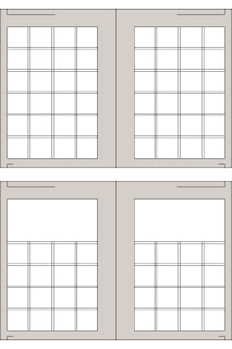

The diagram to the right is a example of a modular grid. Within a modular grid there are gutters, margins, columns, and grid modules. The Grid Modules are the white squares that you see to the right. The Gutters are the black like between each grid module. The Columns run up and down, and the Margins consist of the gray area around the grid modules or edges.
Subscribe to:
Posts (Atom)