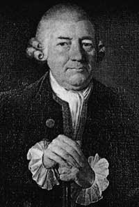
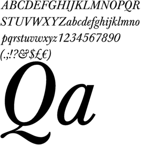
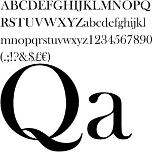
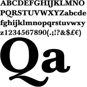
John Baskerville was a type designer, writing master, and a printer. His type faces introduced the modern, pseudo classical style, with level serifs and with emphasis on the contrast of light and heavy lines. Books printed by Baskerville are typically large, with wide margins, made with excellent paper and ink. His masterpiece was a folio Bible, published in 1763.
New Baskerville refines the most attractive characteristics of Baskerville's original form. It was distinguished my a range of weights, giving a total of four: roman, semi-bold, bold, and heavy. The family also include a small caps font. The enhanced contrast makes the lighter weigh roman a little more appealing to the untrained eye, and thin strokes can suffer at small sizes under conditions of poor resolution or low definition printing.
John Baskerville has come a long way considering that his work was never look at as some impressive until our time now when we are researching him in his remembrance of his brilliant font inventions.
No comments:
Post a Comment