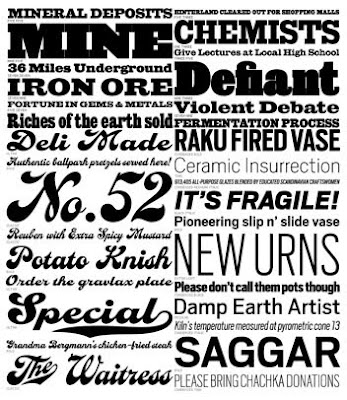
This is the unite of two professional backgrounds of publication designer Roger Black and Type designer David Berlow. Among these two men came The Font Bureau. Things that started them off early was basically doodling and drawing their own designs. This is something that i like to do all the time. I catch myself playing with letters and forming them in different ways. Sometimes when i study i will draw the first letter of something that i need to remember and come up with multiple ways to represent that letter. Berlow was more interested in digital photography. Berlow started his own business in designing newspapers and magazines in 1989 that same year they establishes font bureau. The Font Burea has over 1,500 typefaces and they all have their own flair. On the retail side Font Bureau boasts an extensive and well rounded collection of typefaces and type families from traditional serifs to dingbats.
When i look at these fonts, as with any other font styles and families, i see that there is a very wide variety. This font seems to be a little more in uniform and plain. There is not as much commotion going on from other fonts such as the house industries, which i blogged about at an earlier date.
An interesting site to go and learn more about these fonts, and to see some too is:http://www.fontbureau.com/fonts/
No comments:
Post a Comment