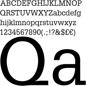
 Adrian Frutiger is the Designer of Serifa
Born
24 May 1928 (1928-05-24) (age 81)Interlaken, Switzerland
This font was designed in 1966-1978
The classification that it belongs to is Slab Serif
Slab Serif Characeristics
minimal variation of thick and thin strokes
heavy serifs with squared-off ends
large x-heights.
vertical stress in rounded strikes
Slab Serif faces generally return to lesser contrast between thick and thin strokes with serifs that are as thick as the strokes and squared off at the ends. While most of these typefaces were exceptionally bold and decorative, reminiscent of the newspapers and wanted posters of the old west, a few were quite refined and remain popular today, such as Clarendon, and Bookman, and Balazio.
The impact of the Industrial Revolution brought profound changes to printing and typography in the 19th century. Manufacturing and mass production of consumer goods had two major effects on print communication: the creation of new kinds of print media and the emergence of more functional type designs for commercial purposes.
For three and a half centuries, typography and printing had been concerned exclusively with the publishing of books. By the early 1800s, the impact of the Industrial Revolution propelled the printing industry in a new direction. The advent of industrial manufacturing created a need to promote the sale of ready-made goods and, as the technology of industry became more complex, manufacturers required a more literate workforce. In addressing these needs, the commercial, or job, printer emerged. New print media, magazines and newspapers, proliferated with great appeal to the masses. Print advertising emerged in these media as an effective way to sell products to the masses.
The impact of technology on printing, paper manufacturing, and mechanical typesetting created a demand for a new style in type design that was compatible with mass-production.
The advent of print journalism and advertising demanded types that were not only readable, but bold and distinctive enough to catch the reader’s attention.
This was the era of Slab Serif, or Egyptian typefaces
This period is generally considered to be backward step in the evolution of type design. The trend toward a more refined aesthetic that began with Transitional forms and continued with Modern types was overshadowed by the dictates of mass production and new print media.
The design of new types was influenced more by commercial popularity than aesthetic development. This notion of popular appeal is illustrated by the fact that many of these typefaces were given Egyptian-sounding names, such as Cairo and Karnak, to exploit the public fascination with the discoveries of ancient Egyptian artifacts. The Slab Serif typefaces are often referred to as Egyptian typefaces.
Adrian Frutiger designed many popular typefaces including Univers, Avenir, Apollo, Egyptienne, Ondine and of course, the Frutiger font family.
a quote by Adrian:
"If you remember the shape of your spoon at lunch, it has to be the wrong shape. The spoon and the letter are tools; one to take food from the bowl, the other to take information off the page... When it is a good design, the reader has to feel comfortable because the letter is both banal and beautiful".
No comments:
Post a Comment